FREE – Battlefield Cross for Laser Etching
July 5, 2017
FREE – Violin, music related preparation for etching
October 30, 2017How We Created a Logo for Our Business

Since we have great plans with our business, and one of the important elements of business branding and recognition is an authentic logo that we did not posses, we started to think of obtaining a suitable one. We are just beginning to actively offer our services on the market, and we have resigned some safe jobs to fully dedicate ourselves to this, and in the uncertain moment in which we are, spending several hundred dollars for a quality, original logo did not sound like a very interesting idea to us.
As we are not certified designers, we have looked for someone who is (or thinks he is), someone who can meet our expectations for a not so big sum of money. We found the “solution” in online services offering such and various other services for smaller amounts of money ranging from $ 10- $ 100. Let’s not get into details, and we certainly won’t mention two online services we used, and to make a long story short – we made a mistake. In the end, we ordered a logo design from four different bidders. Two of these offered solutions that requested 3+ really necessary corrections at the mere beginning! We could not use either one of them, even after our modifications. Absolute catastrophe and $ 130 wasted. We decided to make our own logo.
How to start creating a business logo closely related to the monumental industry?
With research! We have come to the conclusion that logo design is a very serious job that requires awareness, knowledge and creativity. The first step is to focus on the general list of features that a logo must have: genuine, simple, memorable and minimalistic, and it must look good on black and white backgrounds. These are basics.
With this in mind, we have moved on to the messages that our logo should speak and which narrowly represent our business. We asked ourselves a simple question: what are we offering?
Picture editing of often older and bad photographs,
for further processing for memorial portraits for headstone in monumental industry.
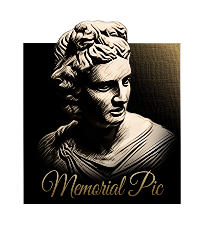
So, our logo must represent stability and permanence, something that resists time and stands proudly and unchanged for centuries. That’s all that a family expects when they order a headstone, together with a quality picture on the headstone to confirm that idea. We decided that the main motif should be an antique Greek statue carved into stone, which will stand upright defiantly for thousands of years as a witness of time and people to come.
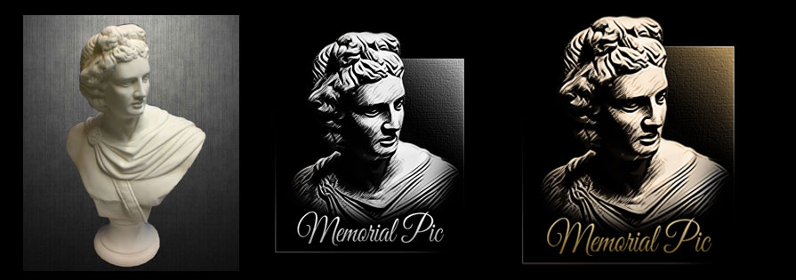
 We have found this picture on google and contacted the owner for permission to use it for the logo. Pictures preparations for laser etching that we do are most commonly portraits, which include upper torso (just head and shoulders) of a person, so we only used that part from the picture we have found. We performed photo editing until we got a satisfactory flat black and white look. We’ve accentuated some sharp lines because we usually prepare these kinds of portraits for engraving in stone, where the depth of the engraving is highly appreciated, so the basic face features of our model looked sharp and deep.
The second part of our services is related to the picture preparations for companies that produce ceramic pictures for headstones. Furthermore, monument companies we work for often order photo editing of the picture, which is to be sent to the production of ceramic pictures. Also, we plan to get involved in the process of making portraits in GLASS ART technique.
All these pictures are commonly found in color and oval shape, which gives the ceramic plaque itself somewhat warmer and blissful appearance. In order to reconcile these two seemingly conflicting statements, we decided to put only a trace of color on our logo and include text that would be written in a mild and nostalgic font. The text also represents something that is usually engraved under the memorial picture on the headstone. We chose the beautiful Great Vibes font, which is completely free for commercial use.
Now that we have an antique portrait and a font to accompany it for our logo, we were still missing that detail that would leave an impression of what kind of business we do. That’s why we decided to put a rectangular frame that represents the headstone around everything. In the upper, right corner, we chose to put mild, light gradient, which represents tangible yet strong structure of a monument, as well as the sun rays that are shedding light on the memorial picture and headstone. These details are intended to say that the headstone and photo of the person will be illuminated and pampered with every new sunrise and will last as long as our sun exists.
In the end we got rid of all of the unnecessary bits and lowered the upper part of the rectangle so that the logo does not look too flat, and to get the effect of a portrait that springs out from the stone, which should represent a life that continues in some other form, which is the core of all religions – belief in afterlife.
After all of this, it was only left to vectorize our new logo. Once again, we are not professional designers and it is possible that in the future we will look for a new logo design or modify this one. However, right now we are more than satisfied with this.


2 Comments
It looks just awesome Alen
Thanks mate, appreciate it!